
Enum-driven SwiftUI TextField Part 1: Creating a State-Driven Floating Label TextField
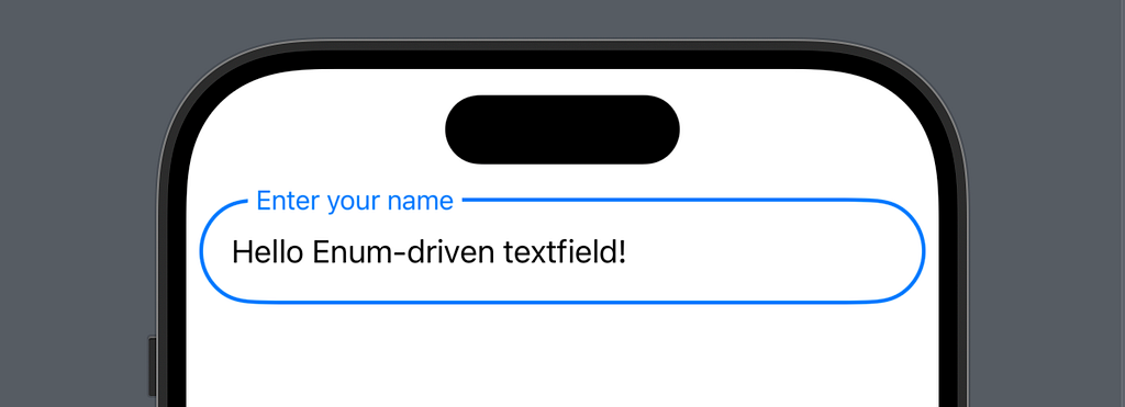
SwiftUI’s TextField shines in its simplicity — clean, functional, and ready to use. But when your app needs floating labels, validation states, or error handling? That’s where things get interesting.
Instead of reaching for a third-party solution, let’s build our own professional-grade input field using an elegant, enum-driven approach that’s:
- Type-safe at compile time
- Easy to extend
- Fully SwiftUI native (my favorite part!)
Core Concept
- Use enums to drive the TextField’s behavior and appearance
- Each state determines how the field looks and behaves
- Simple configuration pattern for future extensibility
Key Components
State Definition
- Idle: Initial state, waiting for interaction
- Focused: Currently being edited
- Inactive: Contains text but not being edited
enum InputState: Equatable {
    case idle
    case focused(InputValidity)
    case inactive(InputValidity)

    enum InputValidity: Equatable {
        case empty
        case valid
        case invalid(String)
    }
}
and we can now drive the UI using our enum:
// UI prpparties driven by input state
extension InputState {
 var tintColor: Color {
  switch self {
  case .idle: return .secondary
  case let .focused(validity):
   switch validity {
   case .empty, .valid: return .blue
   case .invalid: return .red
   }
  case let .inactive(validity):
   switch validity {
   case .empty: return .secondary
   case .valid: return .blue
   case .invalid: return .red
   }
  }
 }
}
Configuration Pattern
// We will expand it more in later articles
struct InputConfig {
    let placeholder: String
}
Main InputField Component View
struct InputField: View {
 private let config: InputConfig
 @Binding private(set) var text: String
 @FocusState private var isFocused: Bool
 @State private var inputState: InputState = .idle

 init(config: InputConfig, text: Binding<String>) {
  self.config = config
  self._text = text
 }

 var body: some View {
  ZStack(alignment: .leading) {
   mainTextField
   floatingLabel
  }
  .frame(height: 55)
  .animation(.spring(duration: 0.2), value: inputState)
  .onChange(of: text) { _, _ in updateState() }
  .onChange(of: isFocused) { _, _ in updateState() }
 }
}

// Sub views
extension InputField {
 var mainTextField: some View {
  TextField("", text: $text)
   .focused($isFocused)
   .padding(.horizontal)
   .frame(height: 55)
   .background(
    Capsule()
     .stroke(inputState.tintColor,
       lineWidth: isFocused ? 2 : 1)
   )
 }

 var floatingLabel: some View {
  Text(config.placeholder)
   .padding(.horizontal, 5)
   .background(.background)
   .foregroundStyle(inputState.tintColor)
   .padding(.leading)
   .offset(y: labelOffset)
   .scaleEffect(labelScale)
   .onTapGesture {
    isFocused = true
   }
 }
}

// State management
extension InputField {
 func updateState() {
  if isFocused {
   inputState = .focused(.empty)
  } else {
   inputState = text.isEmpty ? .idle : .inactive(.valid)
  }
 }

 var labelOffset: CGFloat {
  switch inputState {
  case .idle where text.isEmpty: return 0
  default: return -32
  }
 }

 var labelScale: CGFloat {
  switch inputState {
  case .idle where text.isEmpty: return 1
  default: return 0.85
  }
 }
}
Final Result
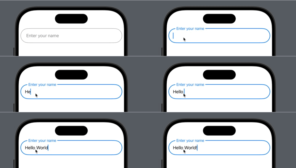
Notes on implementation:
Why private(set)?
The private(set) modifier for the input text serves two important purposes:
1. Read-Write vs Read-Only Access:
- The component can read AND write to the binding internally
- External views can only READ the value
- Prevents unexpected external modifications
2. State Control Flow
private(set) ensures all text changes go through our component’s state management system, maintaining data consistency and proper state transitions.
Why enum for state?
by listing every possible state combination we avoid setting illogical state and benifit from compile time checking:
enum InputState: Equatable {
    case idle
    case focused(InputValidity)
    case inactive(InputValidity)

    enum InputValidity: Equatable {
        case empty
        case valid
        case invalid(String)
    }
}
Compile-time Safety
// The compiler forces us to handle ALL cases
switch inputState {
case .idle: // Must handle
case .focused: // Must handle
case .inactive: // Must handle
} // ✅ Compiler ensures completeness
Impossible States Become Impossible
// CANNOT have invalid combinations like:
// - focused but not typing
// - idle with validation
// The type system prevents these!
Clear State Transitions
func updateState() {
    if isFocused {
        inputState = .focused(.empty) // Valid transition
        // inputState = .idle // ❌ Would be illogical here
    } else {
        inputState = text.isEmpty ? .idle : .inactive(.valid)
    }
}
The enum approach makes our state management bulletproof at compile time.
Wrapping Up
We’ve built a solid foundation for our custom input field using enum-driven state management. By leveraging Swift’s type system, we’ve created a component that’s both type-safe and easy to extend. The enum approach not only gives us compile-time guarantees but also makes our code more maintainable and scalable.
Stay tuned for the upcoming parts where we’ll explore:
- Smart validation rules
- Real-time validation
- Error message display
- Leading/trailing icons
- Date picker integration
- Custom input actions
- Contact picker
- Advanced formatting
- Hybrid input modes
- Comprehensive presets
- Form integration
- Performance optimization
Each part will build upon this foundation while maintaining our enum-driven approach. See you in Part 2!
The complete source code for this part is available below. Feel free to experiment with it and share your thoughts!
//
//
// Enum-Driven TextField by MANGO byte
//
//

import SwiftUI

struct MainView: View {

 @State private var name = ""

 var body: some View {
  ScrollView {
   InputField(config: .init(placeholder: "Enter your name"),
        text: $name)
  }
  .contentMargins(8)
 }
}

#Preview {
 MainView()
}

//Input field and state
enum InputState: Equatable {
 case idle
 case focused(InputValidity)
 case inactive(InputValidity)

 enum InputValidity: Equatable {
  case empty
  case valid
  case invalid(String)
 }
}

// UI prpparties driven on input state
extension InputState {
 var tintColor: Color {
  switch self {
  case .idle: return .secondary
  case let .focused(validity):
   switch validity {
   case .empty, .valid: return .blue
   case .invalid: return .red
   }
  case let .inactive(validity):
   switch validity {
   case .empty: return .secondary
   case .valid: return .blue
   case .invalid: return .red
   }
  }
 }
}

struct InputConfig {
 let placeholder: String
}

struct InputField: View {
 private let config: InputConfig
 @Binding private(set) var text: String
 @FocusState private var isFocused: Bool
 @State private var inputState: InputState = .idle

 init(config: InputConfig, text: Binding<String>) {
  self.config = config
  self._text = text
 }

 var body: some View {
  ZStack(alignment: .leading) {
   mainTextField
   floatingLabel
  }
  .frame(height: 55)
  .animation(.spring(duration: 0.2), value: inputState)
  .onChange(of: text) { _, _ in updateState() }
  .onChange(of: isFocused) { _, _ in updateState() }
 }
}

// Sub views
extension InputField {
 var mainTextField: some View {
  TextField("", text: $text)
   .focused($isFocused)
   .padding(.horizontal)
   .frame(height: 55)
   .background(
    Capsule()
     .stroke(inputState.tintColor,
       lineWidth: isFocused ? 2 : 1)
   )
 }

 var floatingLabel: some View {
  Text(config.placeholder)
   .padding(.horizontal, 5)
   .background(.background)
   .foregroundStyle(inputState.tintColor)
   .padding(.leading)
   .offset(y: labelOffset)
   .scaleEffect(labelScale)
   .onTapGesture {
    isFocused = true
   }
 }
}

// State management
extension InputField {
 func updateState() {
  if isFocused {
   inputState = .focused(.empty)
  } else {
   inputState = text.isEmpty ? .idle : .inactive(.valid)
  }
 }

 var labelOffset: CGFloat {
  switch inputState {
  case .idle where text.isEmpty: return 0
  default: return -32
  }
 }

 var labelScale: CGFloat {
  switch inputState {
  case .idle where text.isEmpty: return 1
  default: return 0.85
  }
 }
}
Credits & Inspiration
This input field component draws significant inspiration from the incredible work of [@sucodeee](https://x.com/sucodeee). If you’re passionate about SwiftUI, I highly recommend:
His content consistently demonstrates innovative approaches to SwiftUI development, and this component is just one example of the professional-grade UI patterns he shares with the community.